Follow the breakdowns
Failures appeared before, during, and after kiosk use—in visibility, instructions, identity, appointment rules, staff response, and downstream queues.
Vecna case study · Healthcare service design
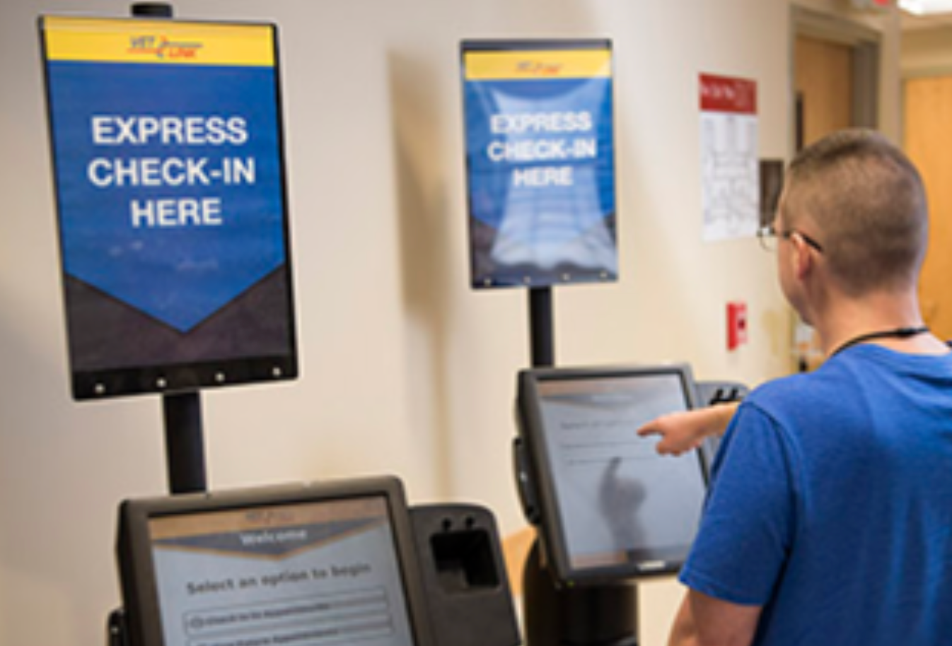
Many early VetLink kiosks, although successful, sat unused or created new work around a broken check-in journey. From 2011 to 2016, I led a team that redesigned the patient and staff experience across kiosk flows, accessibility, signage, operational rules, clinical handoff, reducing average check-in from about 40 minutes to about 2.
A service-level measure, not merely a faster screen.
Medical centers across the United States.
Kiosks across the wider patient self-service platform.
Reported platform reach.
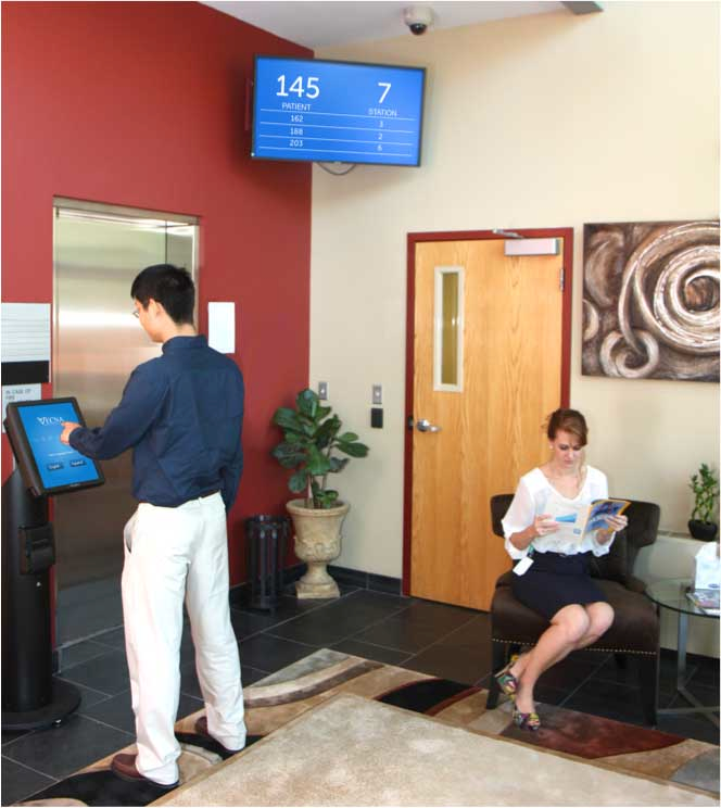
Problem / Broken journey
Veterans encountered paper forms, inconsistent instructions, long queues, and kiosks that were hidden, unavailable, or easy to bypass. Staff spent time interpreting the system and recovering failed check-ins.
The original experience treated check-in as a touchscreen task. In practice it began at the entrance, moved through signage and staff direction, continued through identity and appointment rules, and ended only when the clinic knew a veteran had arrived. Fixing the interface alone would have preserved the broken service around it.
Older, disabled, and stressed veterans met complexity at the first moment of care. Confusion consumed time and undermined trust.
The redesign had to work with VA infrastructure, legacy clinical systems, privacy rules, Section 508 and WCAG requirements, standing reach, and uneven local procedures.
Approach / Field research
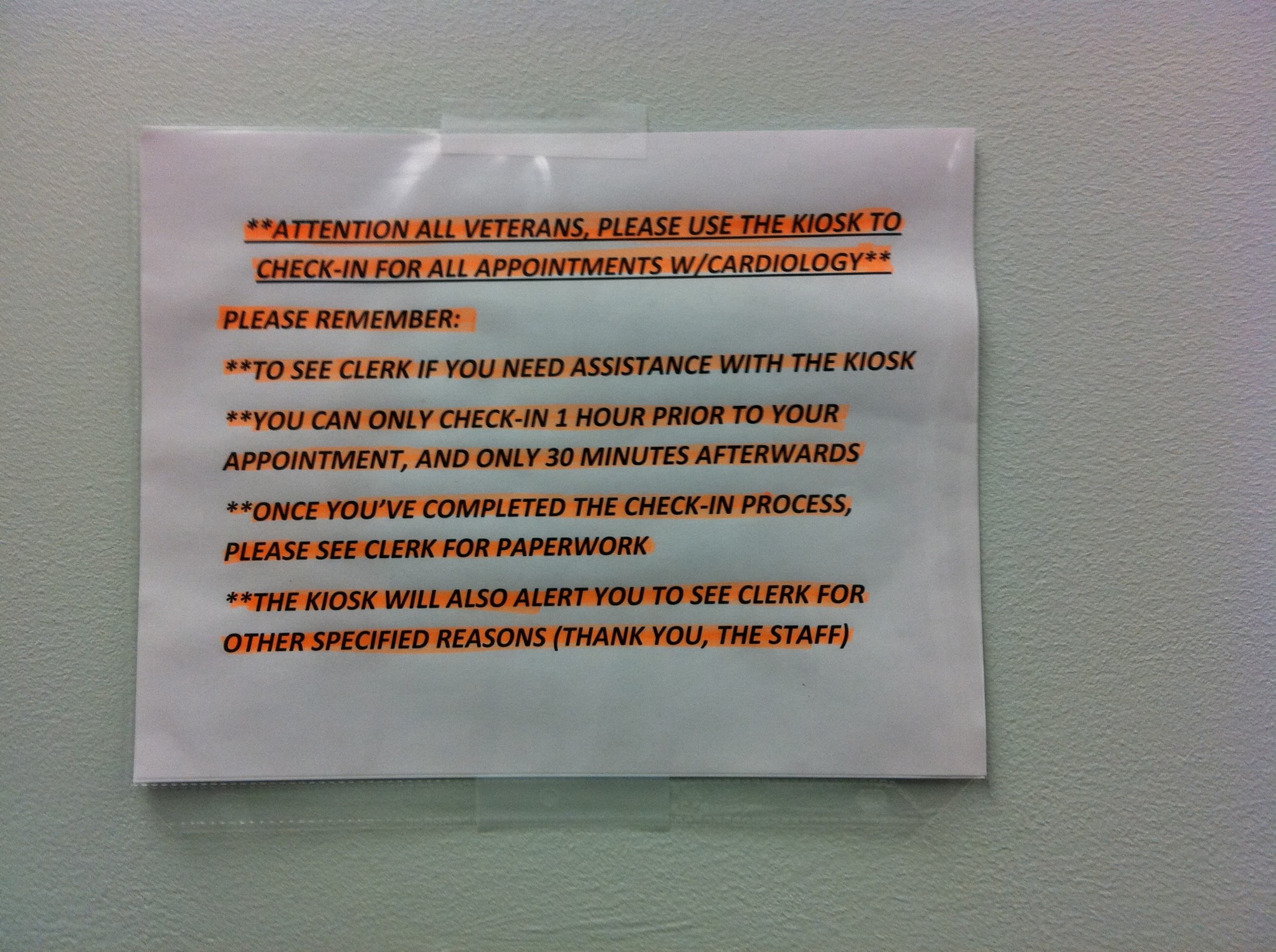
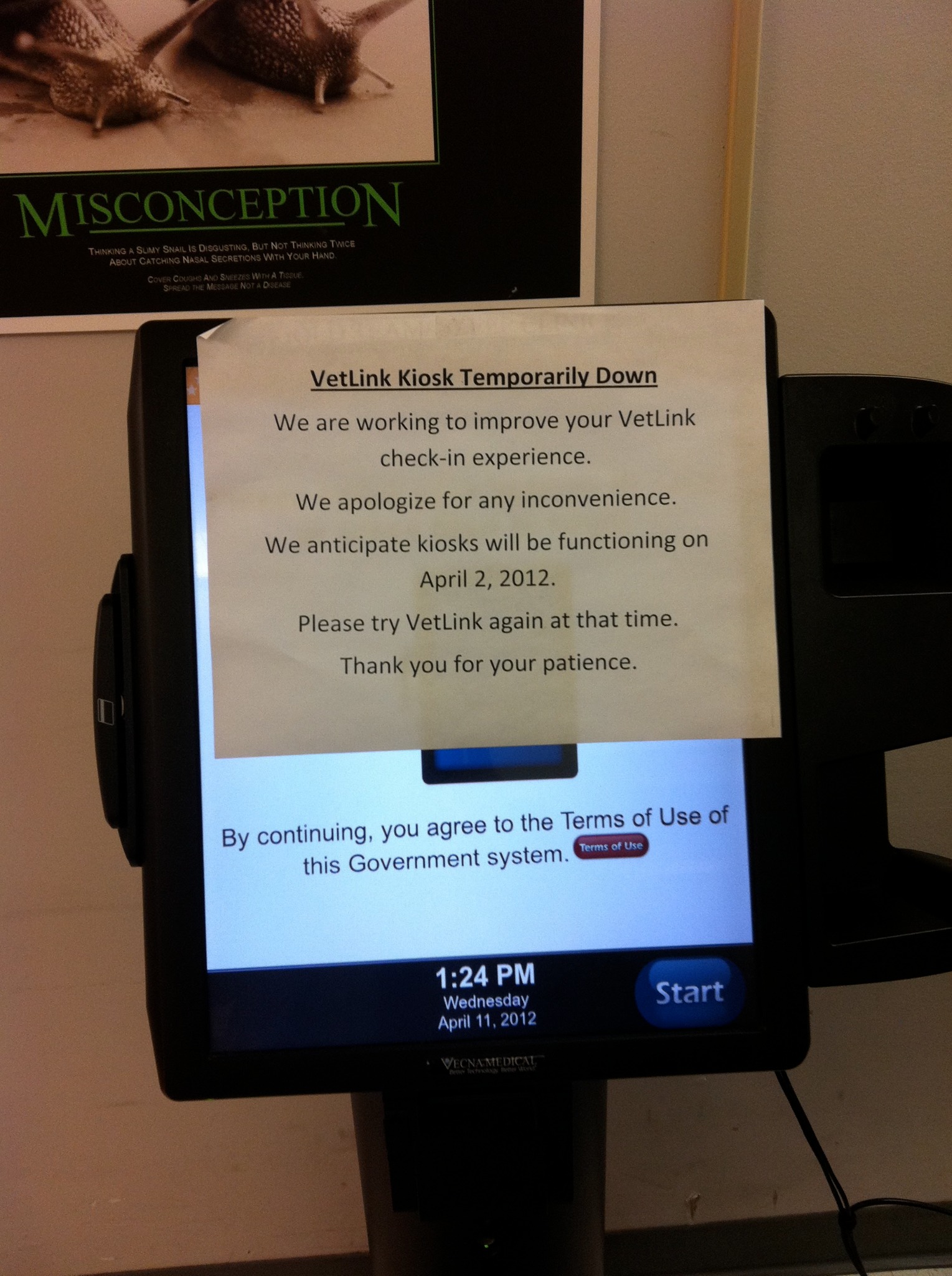
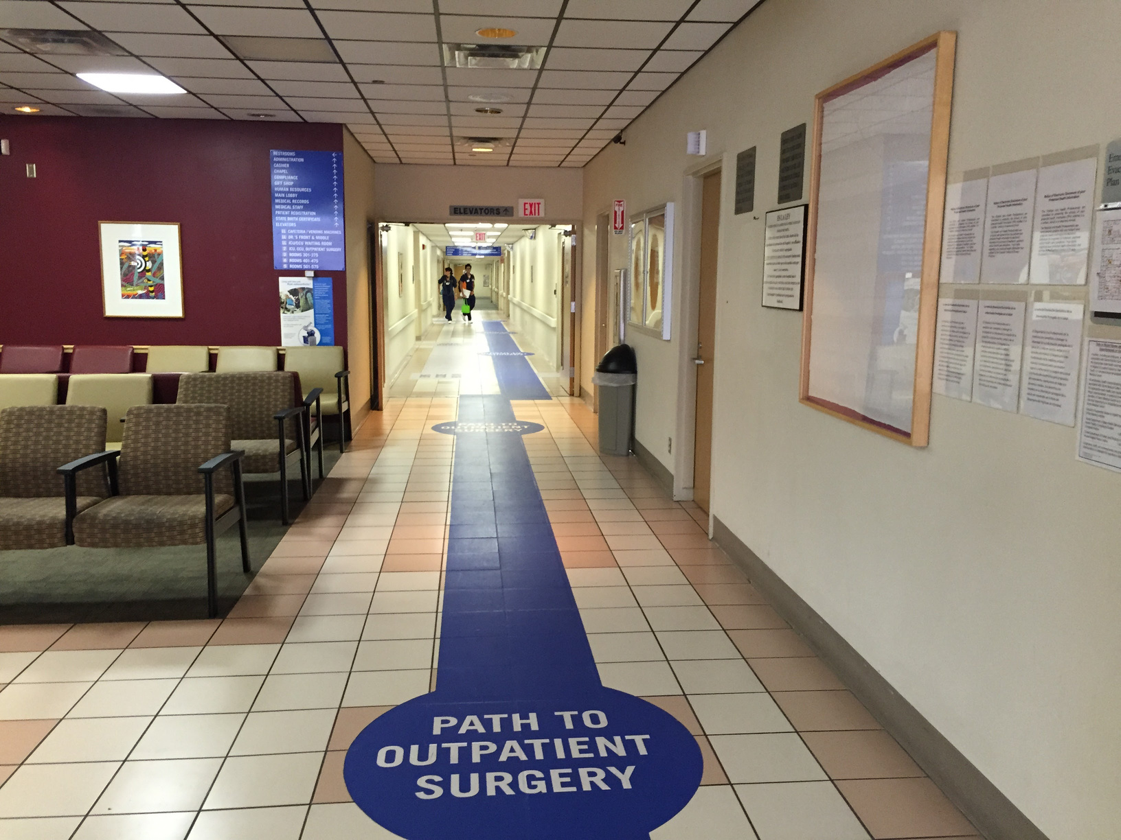
I observed the journey from arrival through clinical handoff, documented where system behavior and human behavior diverged, and used operational measures to keep the redesign honest.
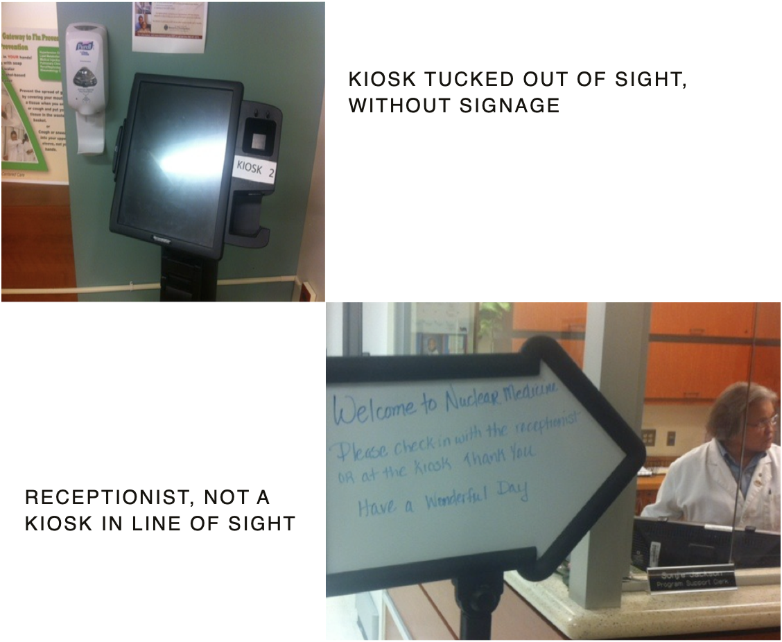
Failures appeared before, during, and after kiosk use—in visibility, instructions, identity, appointment rules, staff response, and downstream queues.
Handwritten signs, paper notices, and repeated staff explanations showed what the formal product and service had left unresolved.
Average check-in time, queue length, error rate, staff intervention, and feedback mattered more than interface polish in isolation.
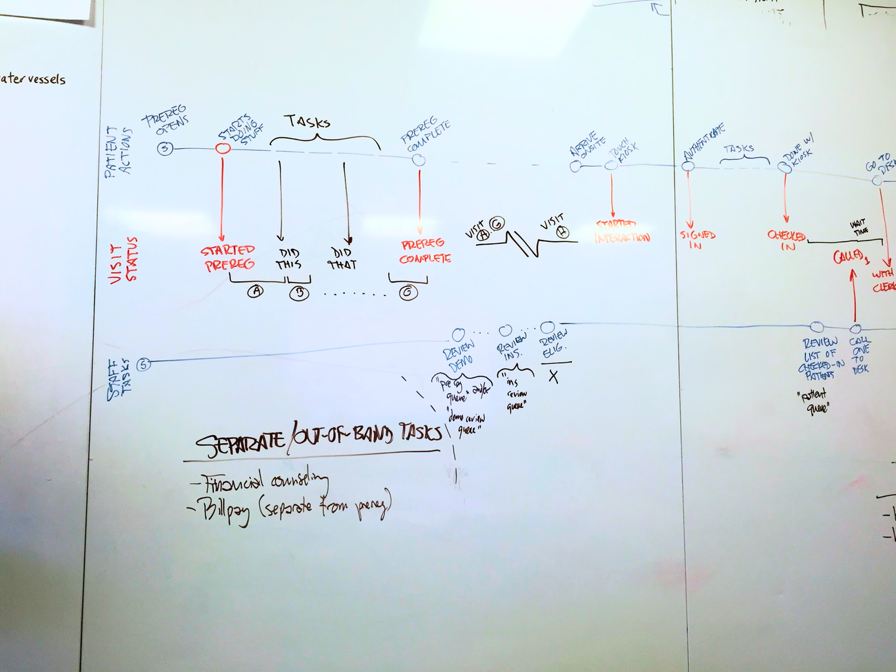
Execution / Cut to essentials
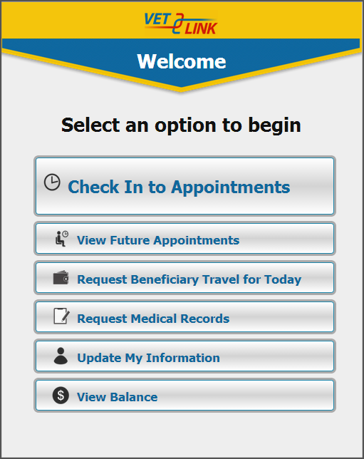
The check-in flow was reduced from 27 taps to only the steps required to finish. Large targets supported standing users with limited reach, one primary action anchored each screen, and full-screen outcomes replaced ambiguous decoration.
Execution / Security without confusion
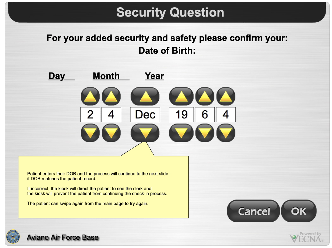
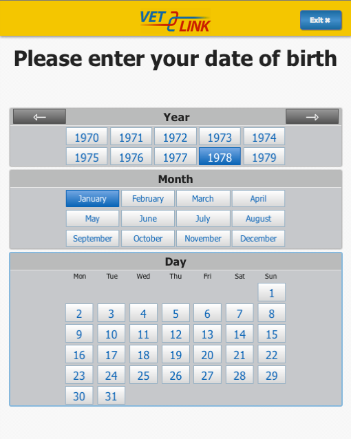
The original date-of-birth control forced users to manipulate six separate spinners. The redesign asked for year, then month, then day—matching how people recall a date and preventing invalid combinations.
Execution / The other side of the kiosk
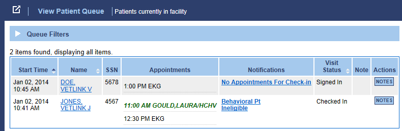
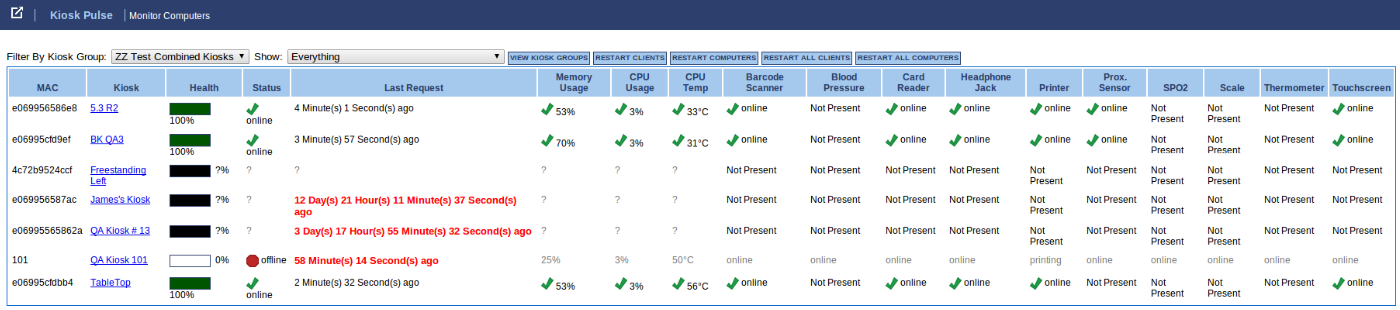
Patient check-in could not succeed unless staff could see arrivals, interpret exceptions, approve updates, manage local rules, and monitor the devices. Training, queue behavior, configuration, signage, and system health were designed as parts of the same service.
What shipped
The shipped work extended beyond the touchscreen into the people, rules, physical environment, and monitoring required to keep check-in working in real facilities.
Simplified appointment flows, identity, demographic updates, directions, records, balances, and clear exception paths.
Patient queues, arrival states, notes, update approval, local templates, roles, and workflow configuration.
Signage, digital displays, wayfinding, hardware cues, staff scripts, training, and a visible path to human help.
Kiosk groups, device and peripheral health, reporting, rollout support, and tools for resolving failures before they reached patients.
Impact
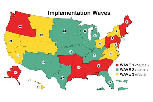
The check-in-time reduction and 154-center rollout describe the VA program. The 6,000+ kiosks and 16M+ patients describe reported scale across Vecna’s wider patient self-service platform. Product, engineering, implementation, VA leadership, local staff, and clinical teams all contributed to these outcomes.
What it proved
The enduring lessons came from measuring the real service, designing for human variation, and treating the organization around the interface as part of the product.
Better UX matters when it visibly reduces waiting, confusion, and staff recovery work at the moment of care.
Designing for older, disabled, stressed, and standing users produced a clearer and more forgiving experience for everyone.
The interface succeeded because kiosk flows, signage, staff workflow, local rules, system health, and clinical handoff were aligned.